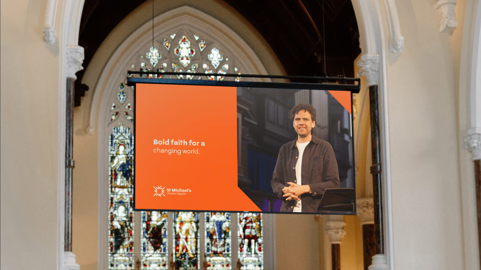
Rebranding St Michael's Chester Square
"CloudCut freed me to focus on what I need to do as a church leader."
"I have worked in church communications for a decade. This is the first time I've experienced everything working as I've wanted it to, and far exceeding those hopes. From first deliverables, CloudCut instantly lifted our online output. They bring excellence that very obviously elevated what a church can produce. As a church leader, most of my job is communication, in all sorts of ways. I have a background in design and probably care too much about aesthetics...I can trust them to get on with it and drive it forward."
The brand is a statement of our new season. It's ushered people from curious to committed in ways the old look never could.
increase in social engagement
followers in 3 months
weeks from start to launch
From brief to bold
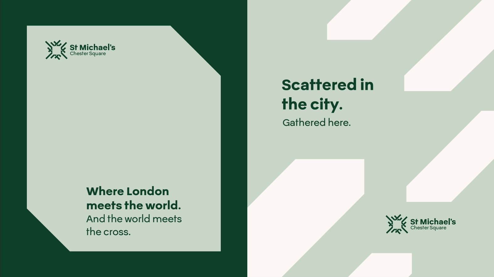
St Michael’s Chester Square sits at one of London’s great meeting points. Just moments from Victoria Station, people arrive from every corner of the city and far beyond it. We wanted the new identity to capture that sense of movement: a church where people gather to encounter God, before being sent back out to live the way of Jesus wherever they go.
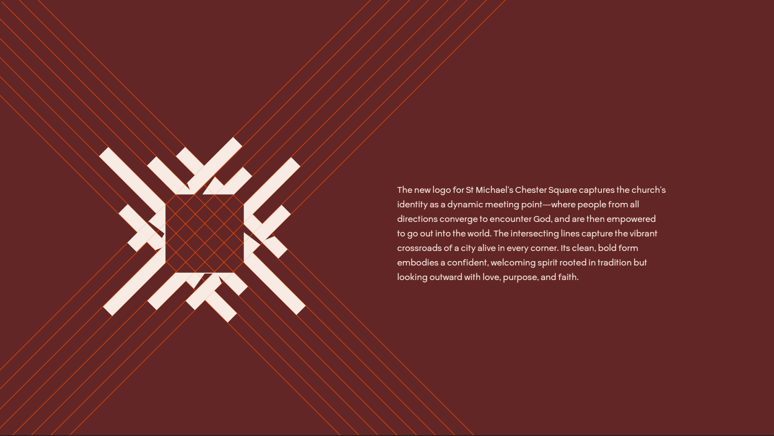
That idea became the foundation of the brand. Intersecting lines create a visual language inspired by the crossroads of the city, with people travelling from different directions, meeting at one point, then scattering again. The system gives St Michael’s a distinctive graphic device that can continually shift, move and adapt across everything from social media to Sunday communications.
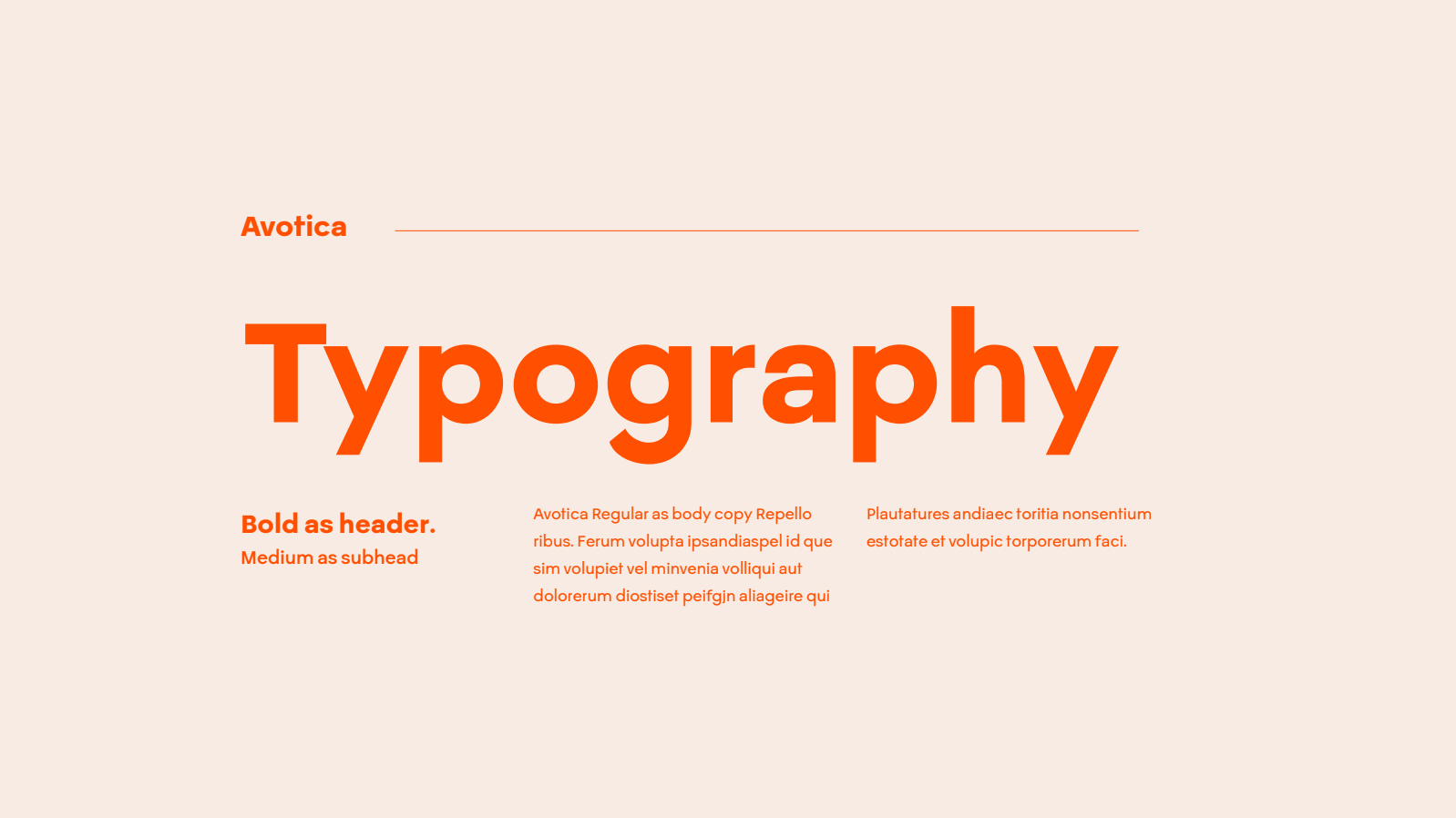
Under the leadership of Vicar Jamie Mulvaney, St Michael’s is entering a confident new season, rooted in the historic Christian faith while speaking with clarity and hope into contemporary culture. We reflected that tension through a clean, bold typographic approach and a colour palette that brings old and new together. Deep reds and greens carry a sense of heritage and permanence, while vivid orange introduces energy, creativity and optimism.
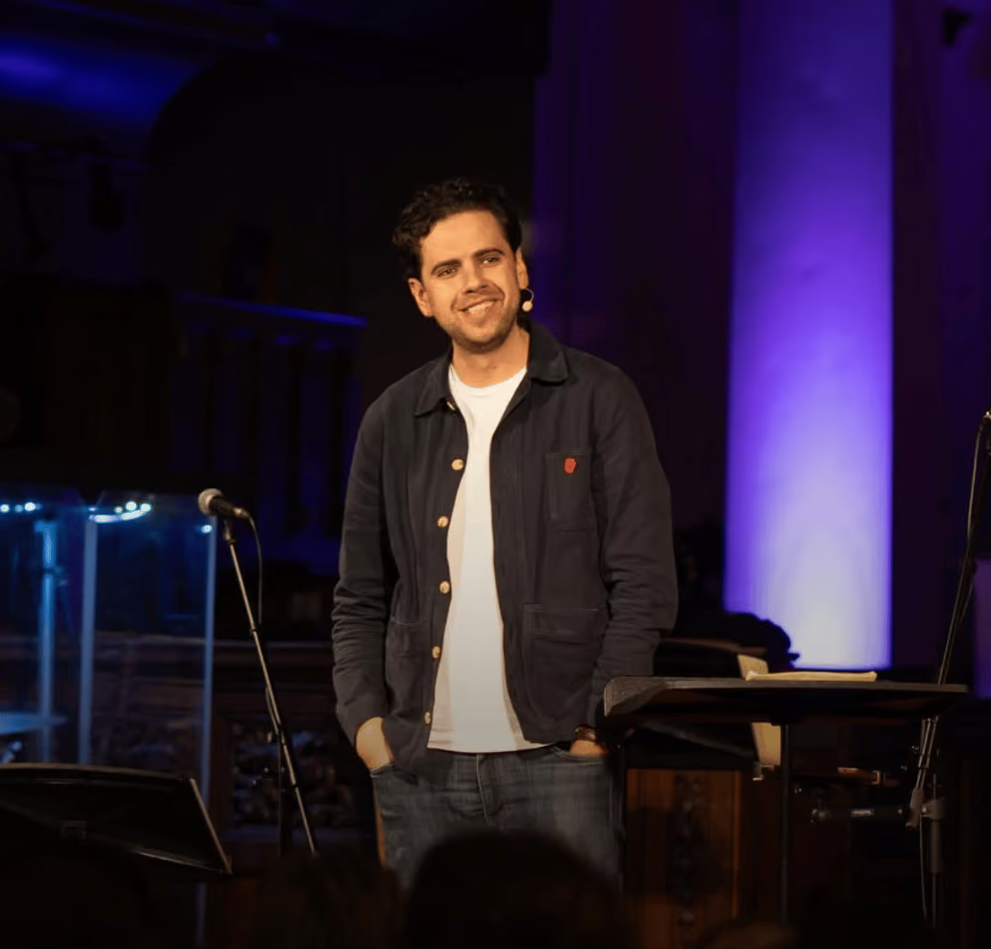
Photography completes the identity with warmth, light and humanity. Rather than simply documenting church activity, the photography direction focuses on people, creating a sense of welcome, life and genuine connection. Together, the identity gives St Michael’s a brand that feels unmistakably connected to its place and purpose: gathering people from across London, forming them in Christ, and sending them out to bring life to every corner of the city and beyond.
Get clarity today. Book a call.
A 30-minute Clarity Call with Joel and the team. We'll talk through where your church is at and whether we could help.